Background
Overview is an educational entertainment experience geared towards teaching a Gen Z audience about how design ethics affect the way we engage with the world around us.
It comes in the format of a printed mini-magazine, and an accompanying mobile website. This project was completed over the span of 3 months in 2020 as part of a group design project in college.
Our group was prompted with the question: “what does design ethics mean?” and tasked with explaining our answer to an audience of our choosing in an engaging way. After a bit of research, we identified an opportunity to target a younger impressionable audience to help them understand how design ethics might affect them in their own lives.

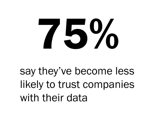
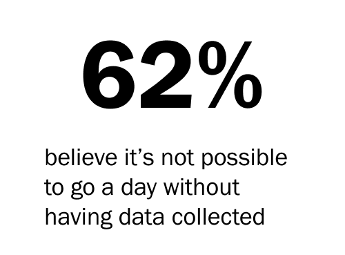
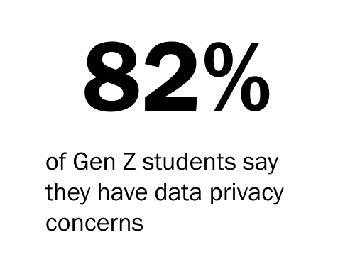
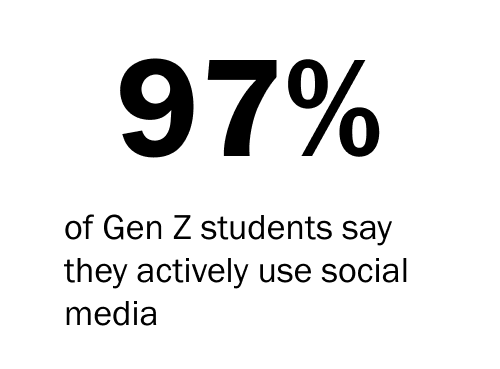
As a team of 6, each member working on this project was tasked with creating two spreads for the magazine and accompanying web experience, each on a design-ethics related topic. The topics I focused on were user data, and dark patterns.
We all worked together to create some branding materials and reach an overall style for the project: Digital stranger danger, which would take the retro 90s aesthetic beloved by teenagers of the 2020s and add a digital twist.

Color Library
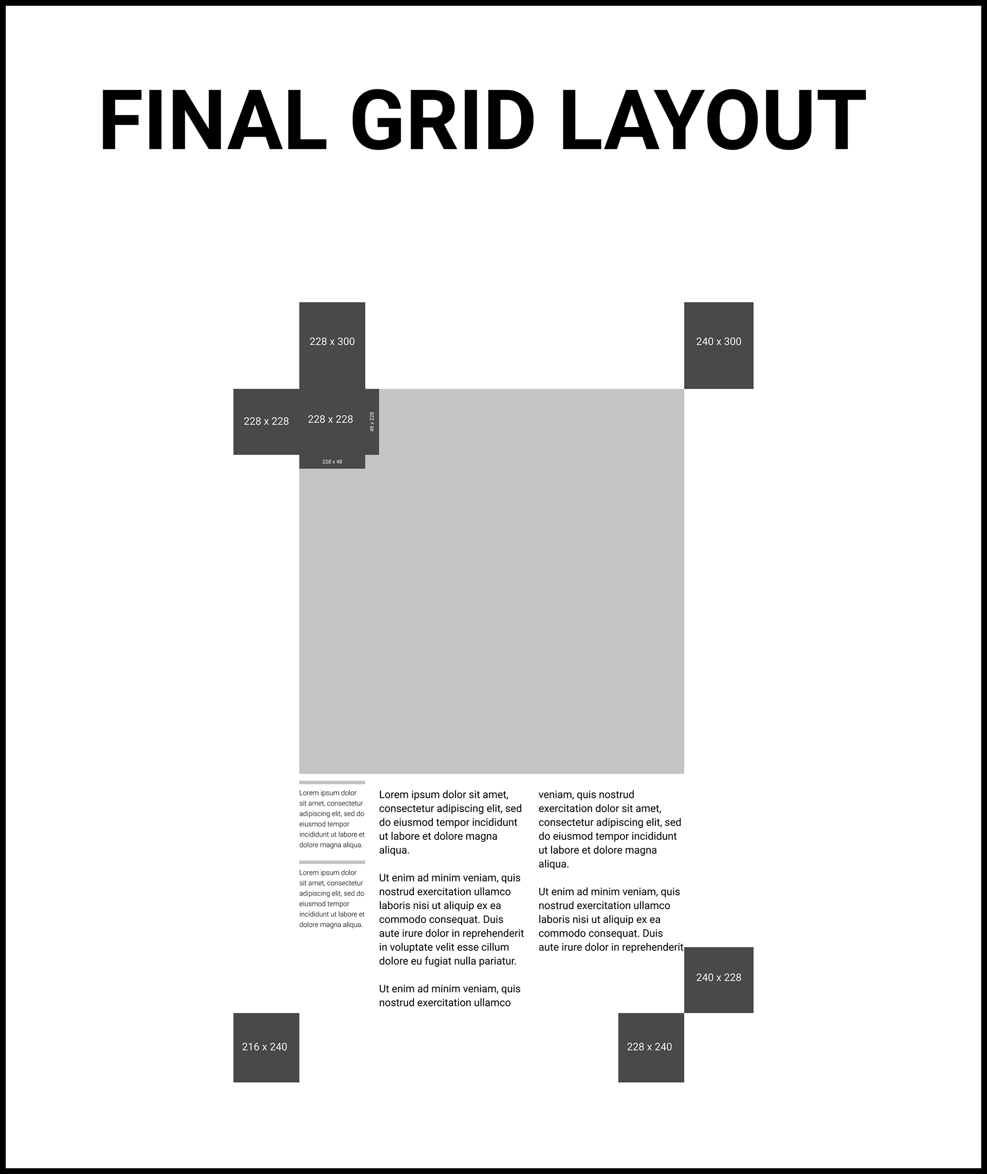
Grid Layout
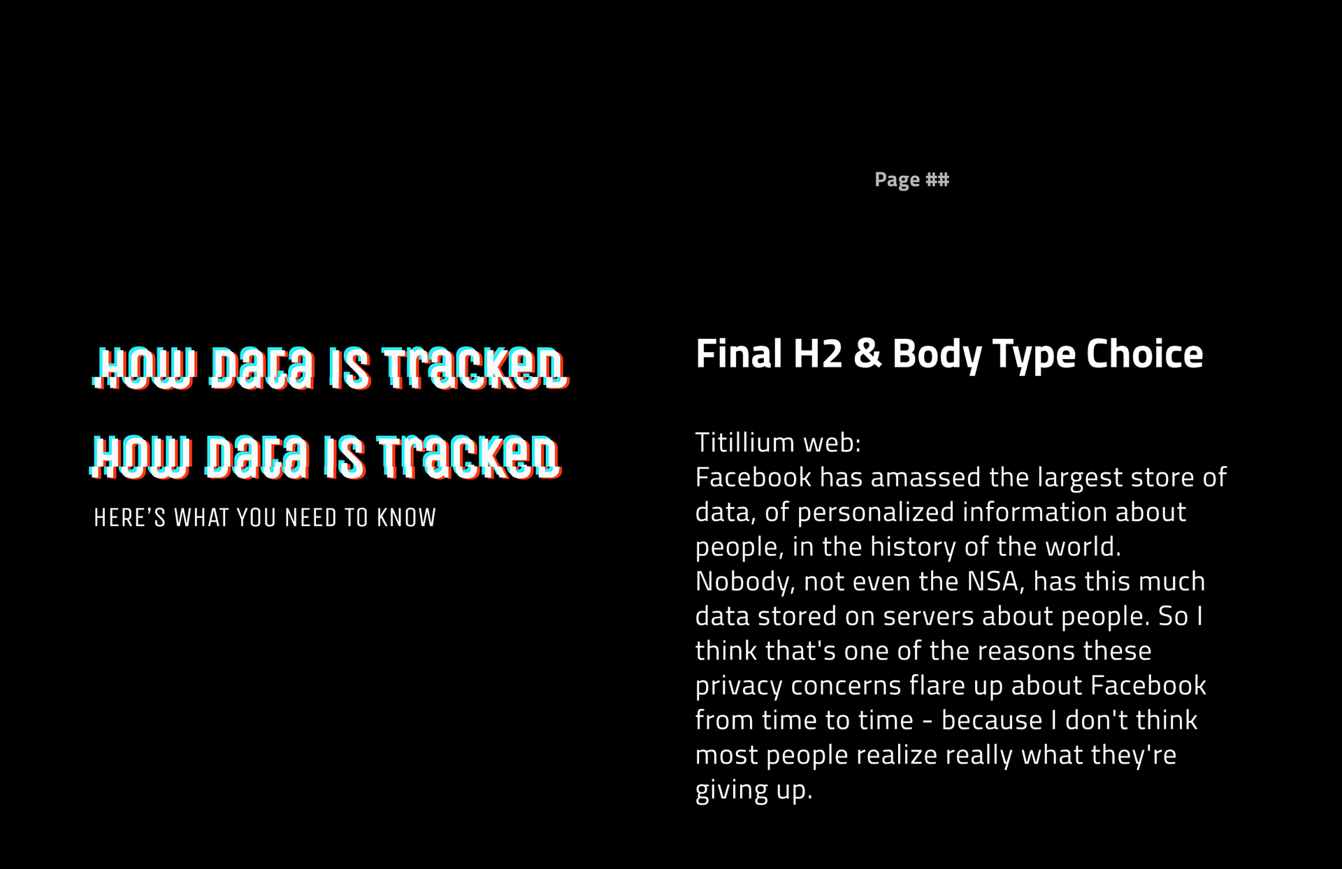
Dark Style Guide

Light Style Guide
Spread #1 - User Data
My first print spread and the first page in the zine introduces the reader to the idea of user data collection with a short excerpt, and also features a user data “personality quiz”, inspired by the kind of thing you’d see in a 90s tabloid or buzzed article today. The goal: answer the survey questions to determine how much your apps know about you.
The accompanying digital experience, accessible via a QR code on the front of the zine, highlights different types of user data, and what each type might be used for by a nefarious actor who collects it - to hopefully give the reader a little bit of context on what’s happening to their info. It’s also housed in an Instagram story-like interaction, to give a familiar feel to the user and a cheeky nod to the entities who might be collecting user data.
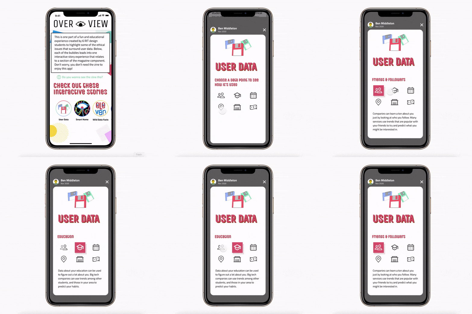
Data Point Index
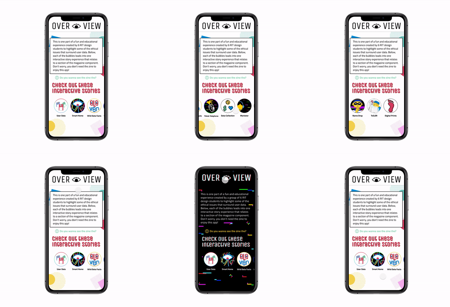
Story Navigation
Spread #2 - Dark Patterns
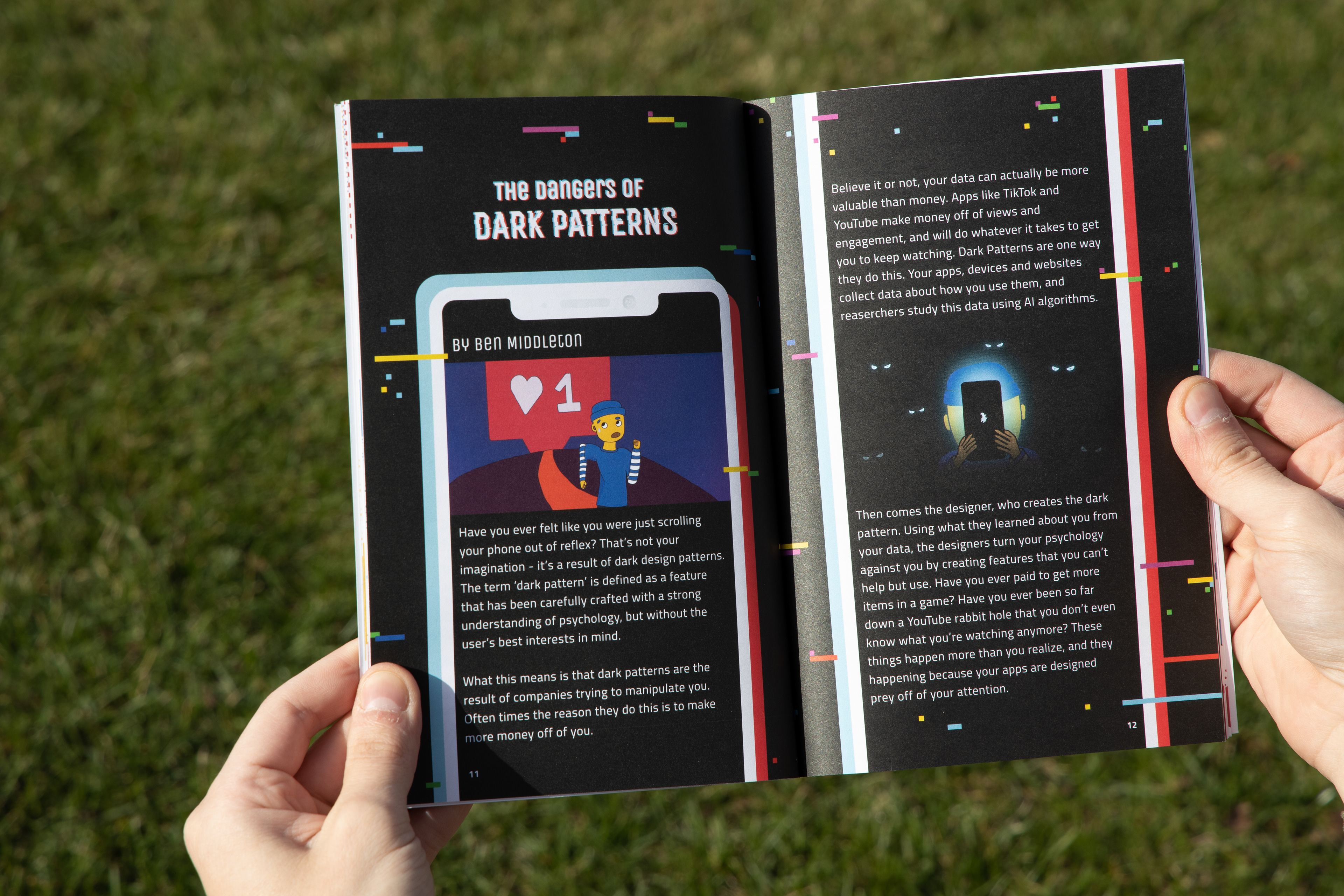
Now that the reader has an idea of what user data is and how it might be used, my second spread introduces the idea of “dark patterns” as the way a digital experience might manipulate a user to get them to perform a certain action, or collect aforementioned user data. The spread features a couple illustrations as visual metaphors for these dark patterns.
The digital experience for dark patterns features a couple interactive examples of dark UX patterns, like “roach motel”, “bait & switch”, and “confirshaming” for the user to experience firsthand, and hopefully be vigilant towards these patterns in the future.
Reflection
Looking back, I'm really satisfied with the way this project turned out. Ethics is a topic I value highly, and having an opportunity to start a conversation centered around it is something I appreciated.
Creating a hybrid print-digital experience was also super fun; I enjoy when a story can take place across multiple connected mediums, and felt like this was a really engaging way to educate an audience on an important subject.
Finally I want to add a shoutout to the thoughtful and talented group of designers I worked with on this project - collaboration with these teammates could not have gone smoother, and I think we were all incredibly proud of the holistic product we put together (remotely during an unfolding COVID pandemic nonetheless.) Beyond the team itself, this project would never have been possible if not for lots of hard work by our amazing professor Miguel Cardona. 👏
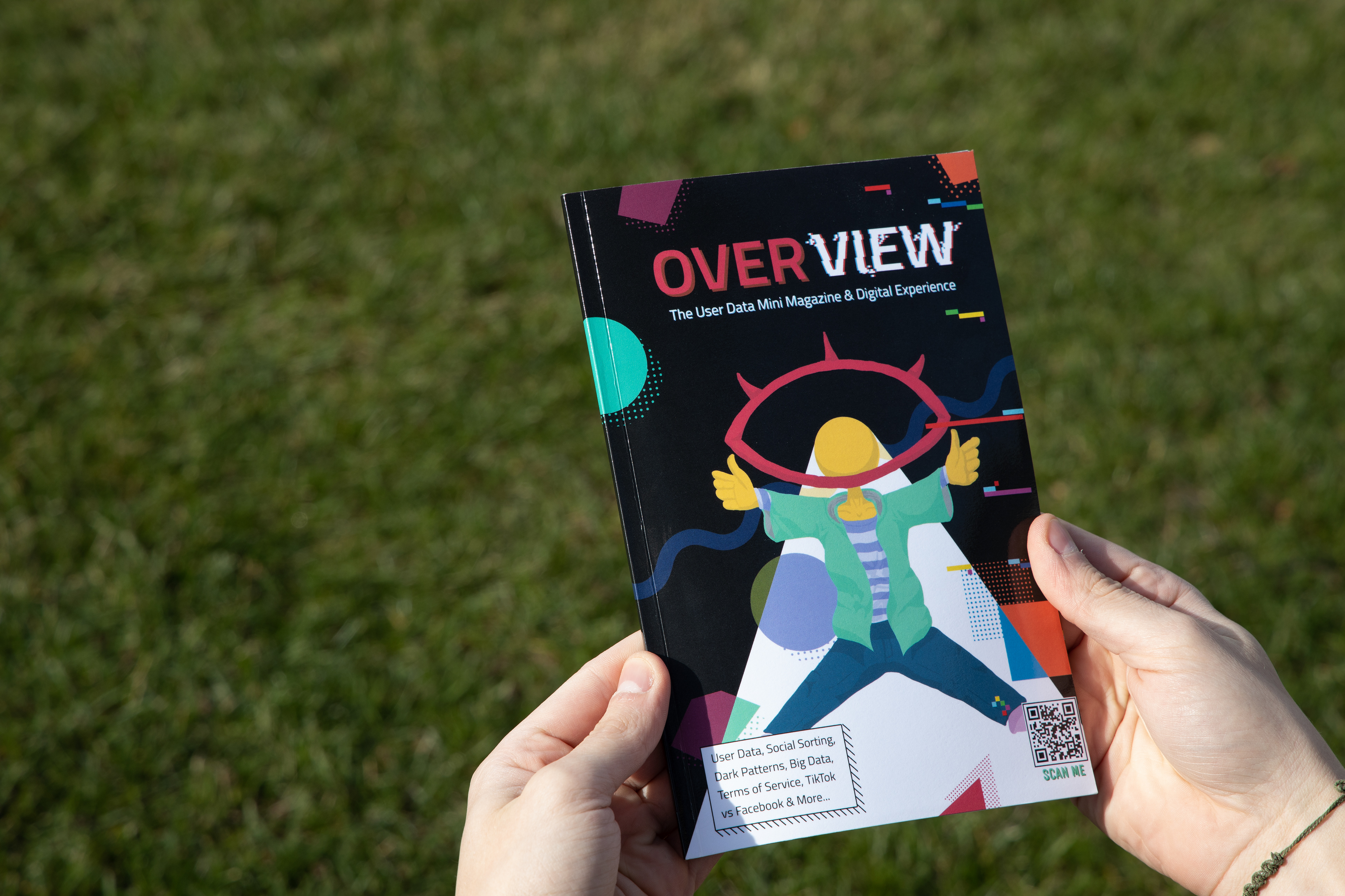
Photo - Cover
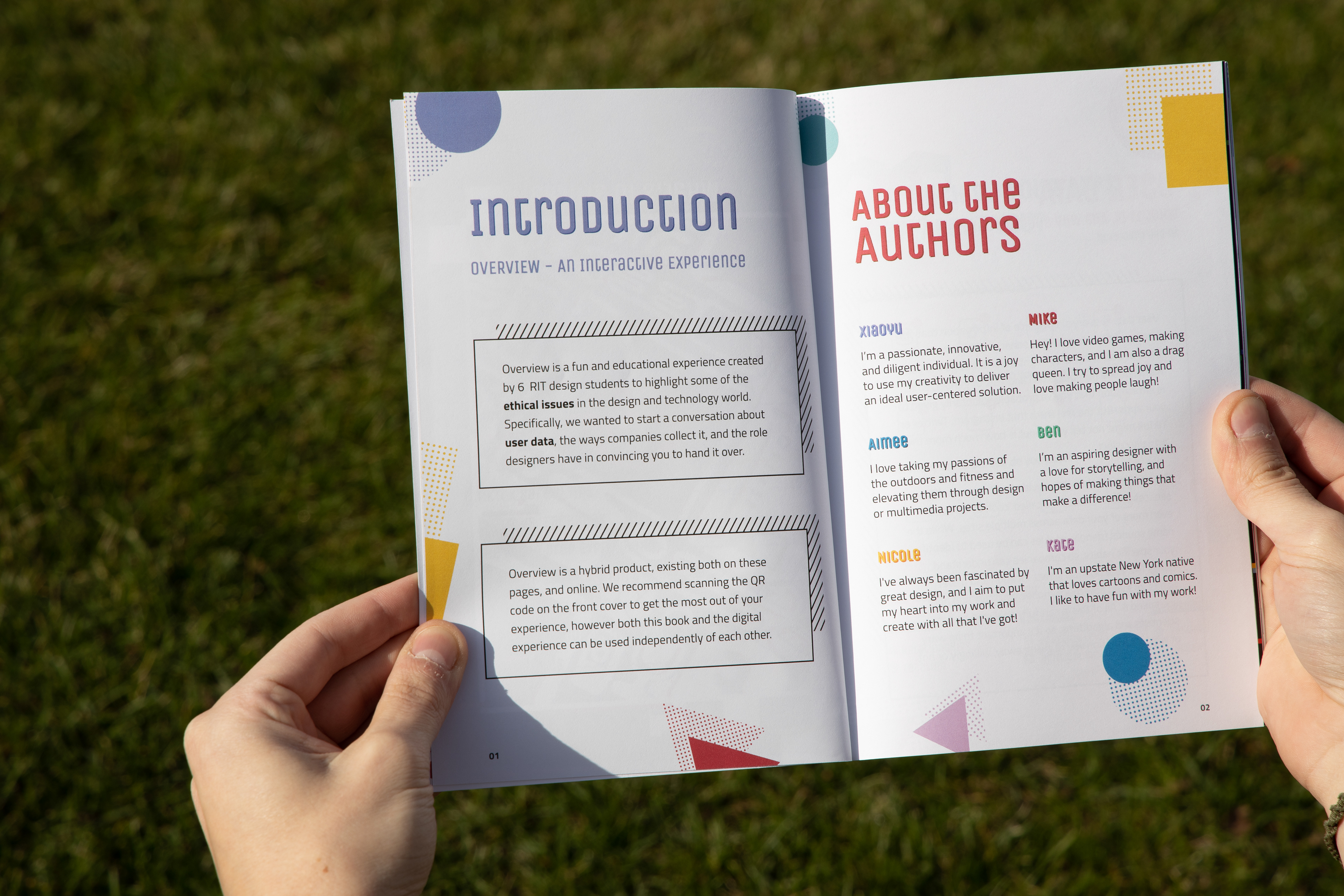
Photo - Preface
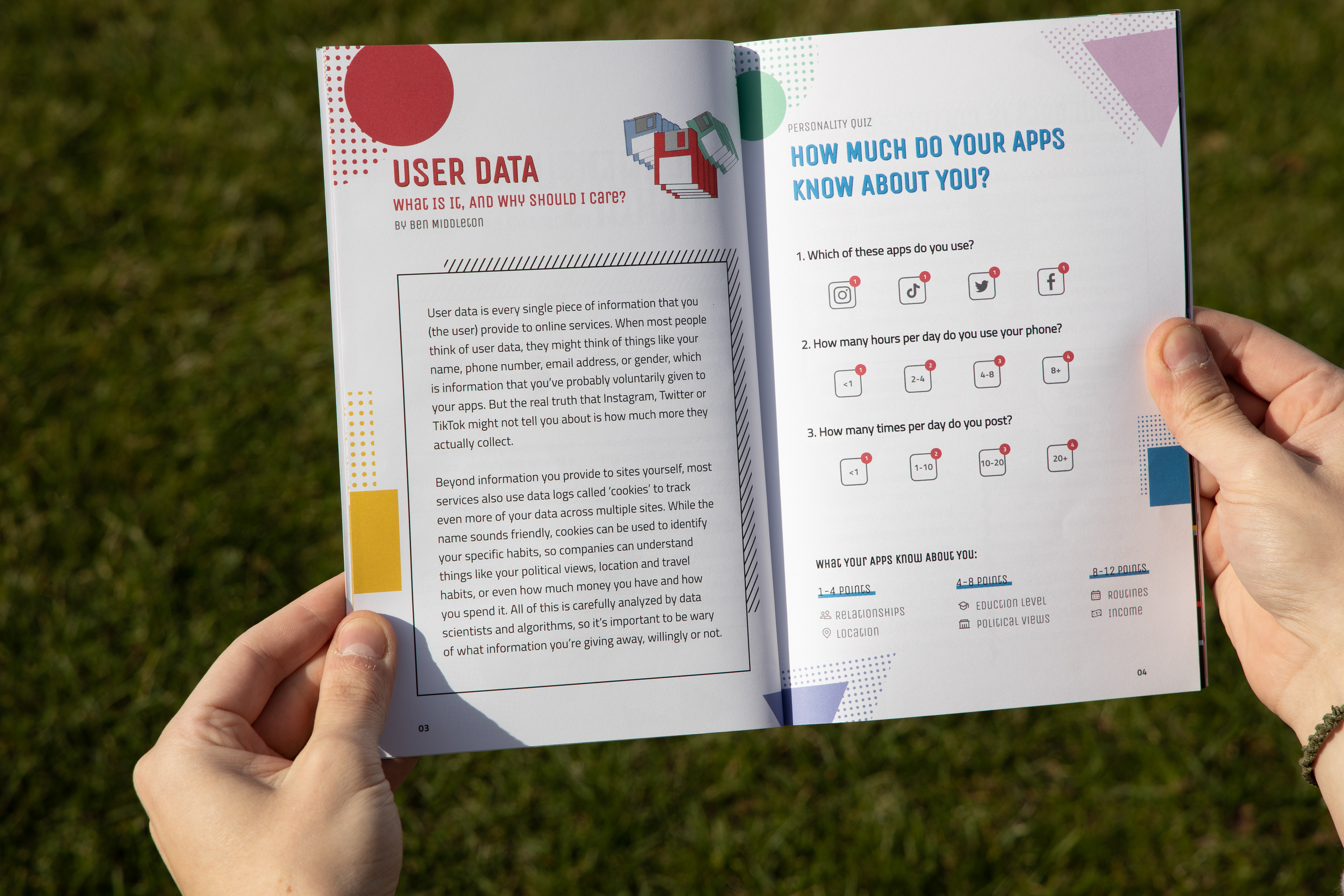
Photo - User Data Spread
