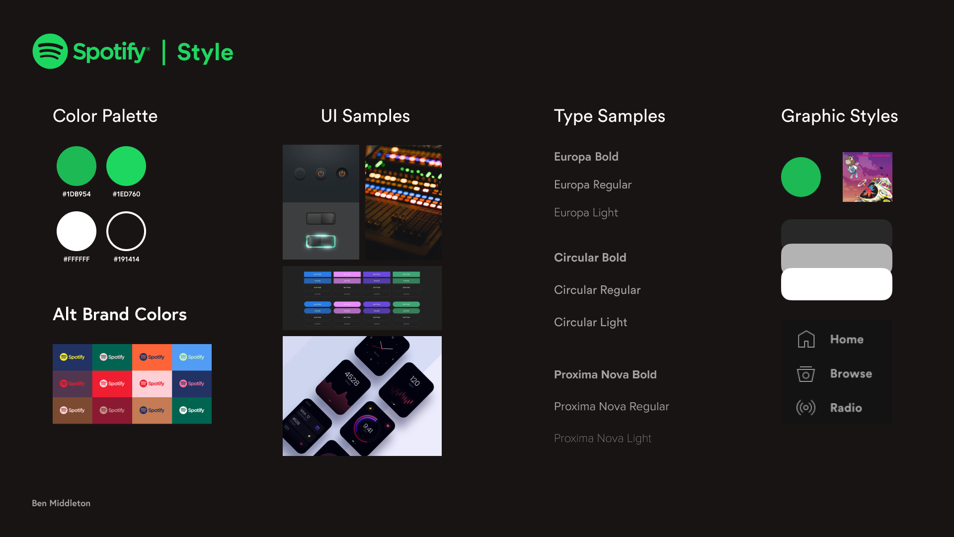
As part of an exploration into micro-interactions, I wanted to reconstruct Spotify's UI System.
Checkboxes
Multi-Switch
Slider

Toggle
Radio Selection

Button
Brief:
I’m a firm believer in the saying “it’s all in the details.” Micro-interactions are the perfect example of this. Every interaction in a UI system, however small, contributes to the overall experience that a user has with that product. By creating a system of enjoyable and cohesive micro-interactions, a larger product can become much more enjoyable for the user.
Idea:
For this study, I intended to take some existing interactions in Spotify's web and mobile UI systems and re-imagine them to better understand what makes them successful. My key focus was keeping branding and graphic elements consistent while trying to beg the question: "how can this interaction be delightful?"
Branding:
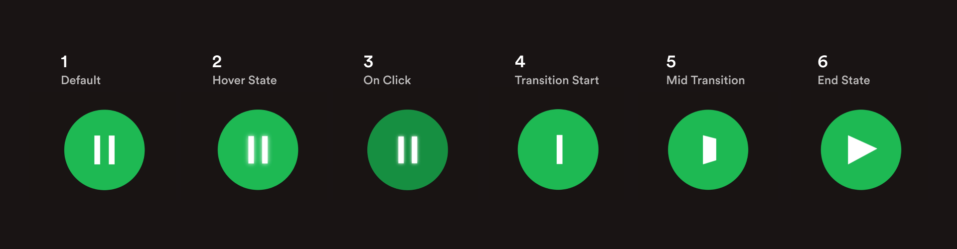
Toggle:

Old Play/Pause Button
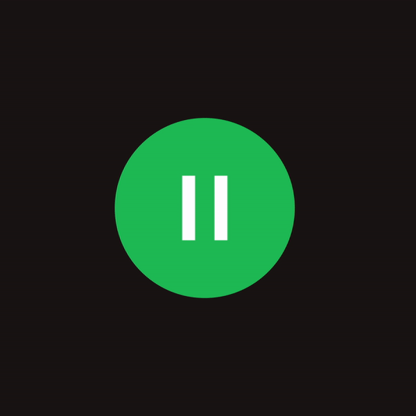
New Play/Pause Button
In exploration of toggle interactions, I chose to redesign the play/pause button toggle featured all over Spotify’s interface. The old button had only 2 states, and transitioned instantly between them with no animation. For my button, I aimed to keep the interaction small enough where it could be done repetitively without excess, but wanted to animate the state shift with the goal of adding a little bit of delight to the experience.
State Breakdown:
Button:
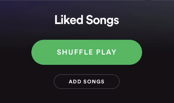
Old Shuffle Button
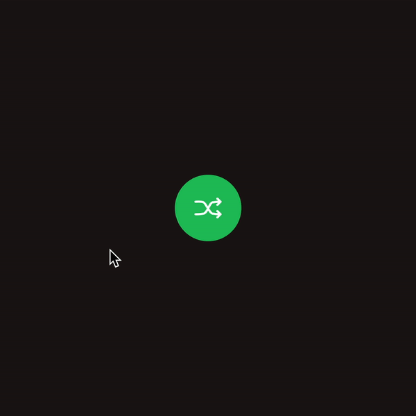
New Shuffle Button
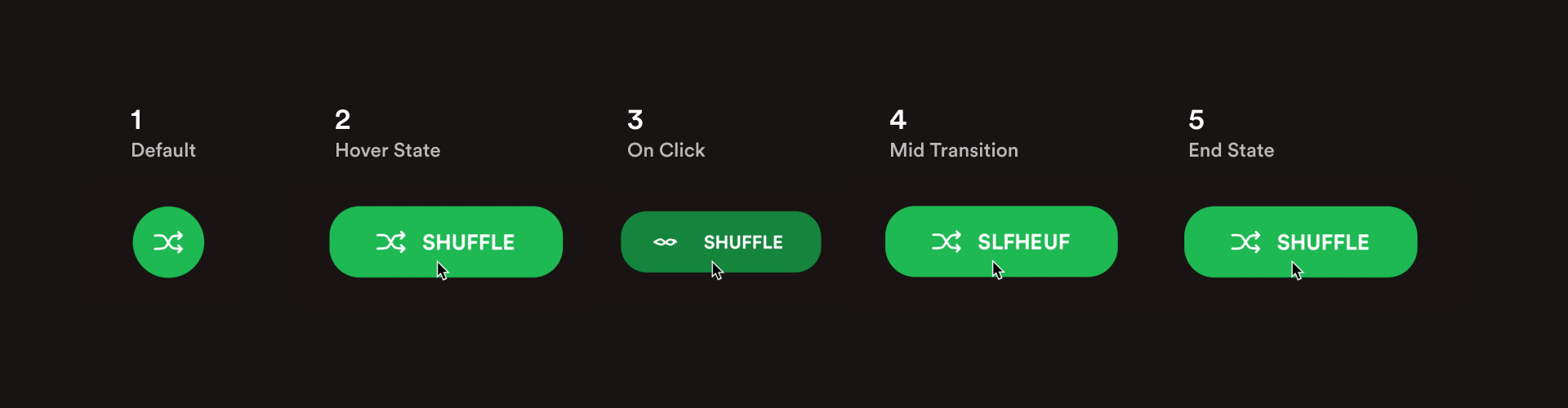
For the study of a singular button, I wanted to create a button that was visually representative of the shuffle action - something more elaborate than the existing button but still on-brand and simple. There were multiple versions of this button featured on desktop and mobile, but I saw the new one as a sort of hybrid that could live on either, designing it as a compact circular button that can also be expandable for a more exciting interaction.
State Breakdown:
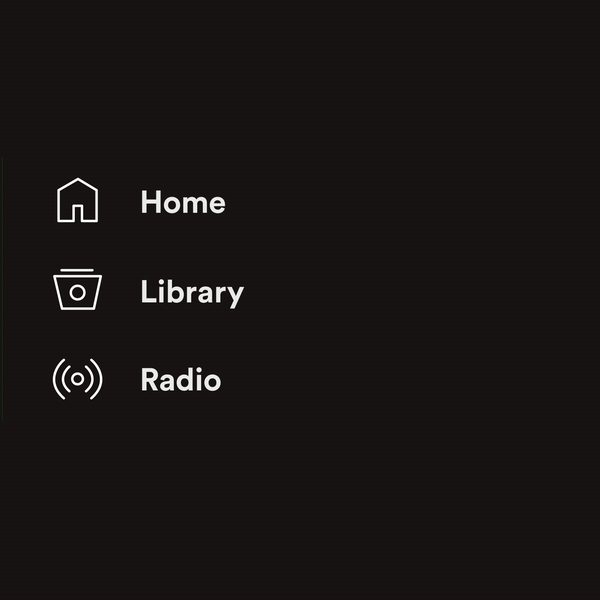
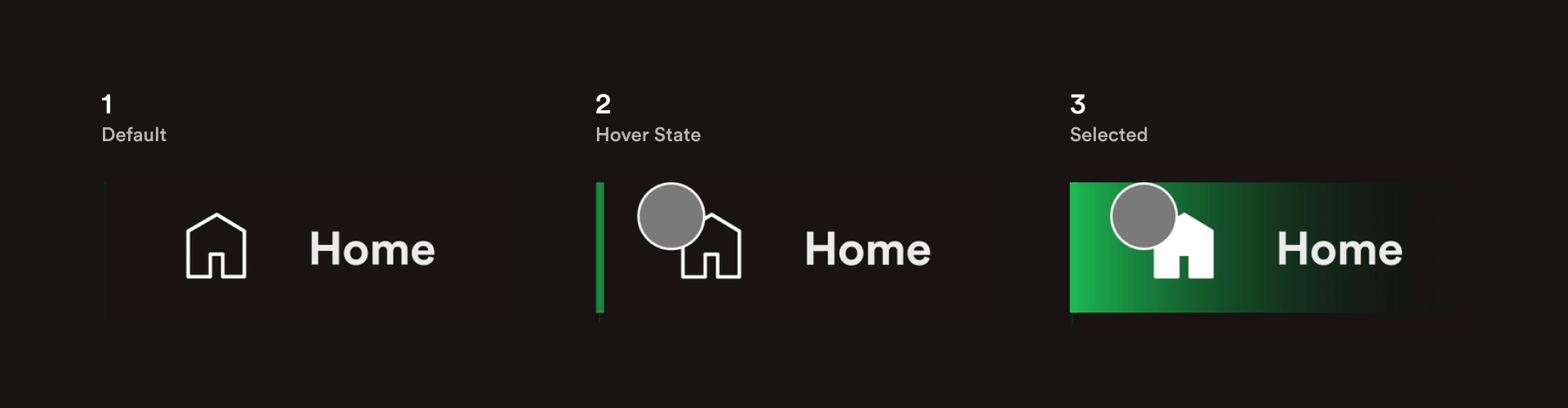
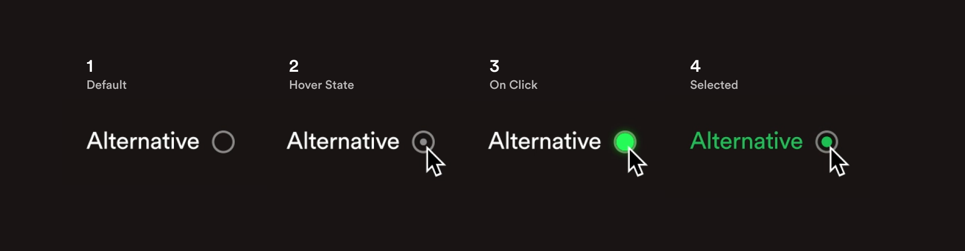
Radio Buttons:
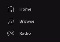
Old Radio Buttons

New Radio Buttons
Radio buttons are a set of buttons that can be switched between, with only one being active at a time. To explore a variation of this interaction, I recreated Spotify’s main navigation buttons. I didn’t change a whole lot, but wanted to bring a little more color to the interaction, and add a longer/more prevalent transition animation.
State Breakdown:
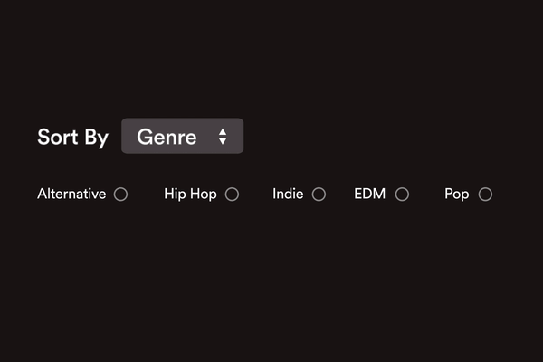
Checkboxes:

New Interaction (with checkboxes)
Another interaction I wanted to study was a check box system. While this interaction model doesn’t currently exist in Spotify’s system, I imagined it as a subset of genre selection filters. In order to create a satisfying interaction, I modeled my 'selected' animation to be more fluid, like a drop of water falling into a lake.
State Breakdown:
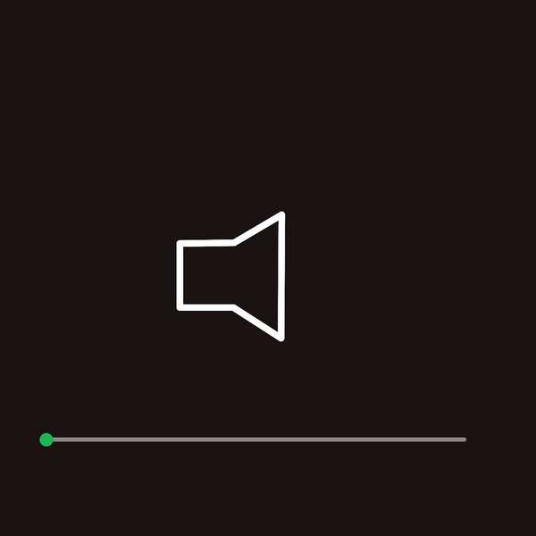
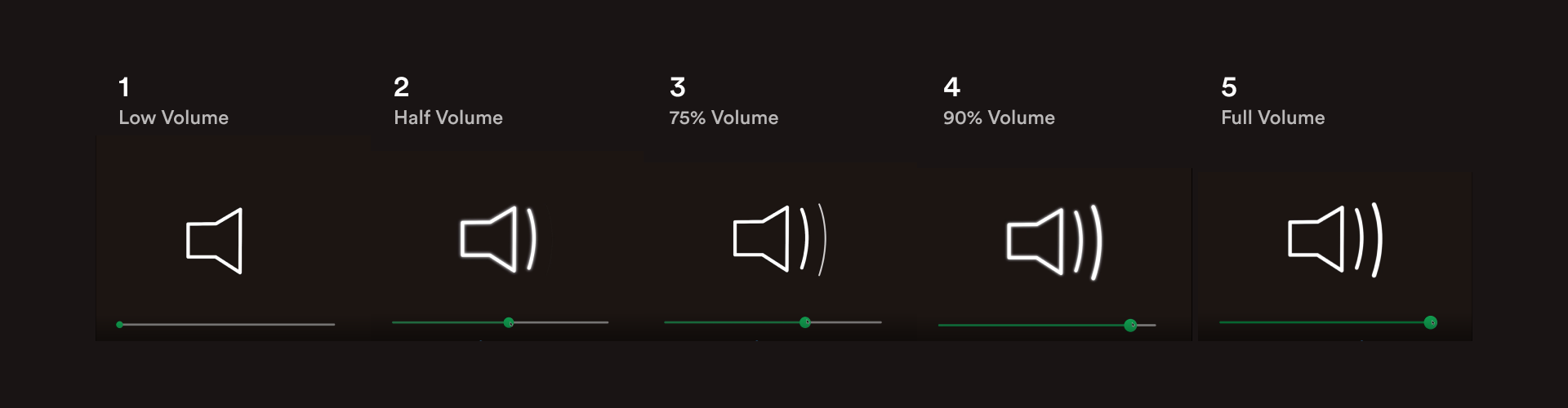
Volume Slider:
Old Volume Slider

New Slider
For my study of the slider interaction, my goal was to create graphic components that could be rearranged to fit anywhere in the interface. The original slider worked well, although graphically it seemed like the most skeumorphic element in Spotify’s current system. I imagined the new slider as a larger part of the interface, rather than being resigned to a small section at the bottom of the screen.
State Breakdown:
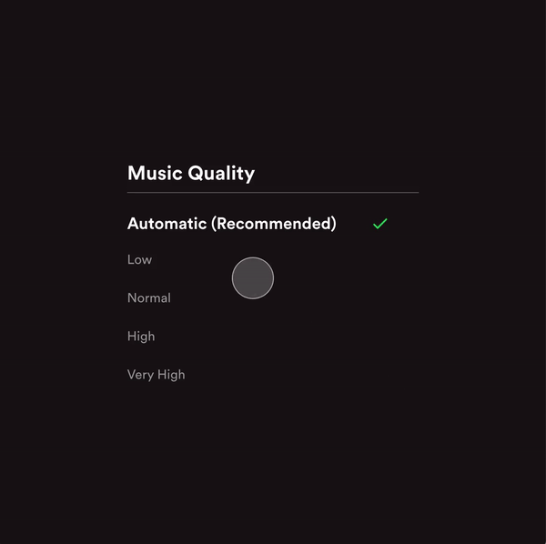
Multi-Switch:
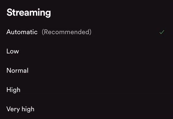
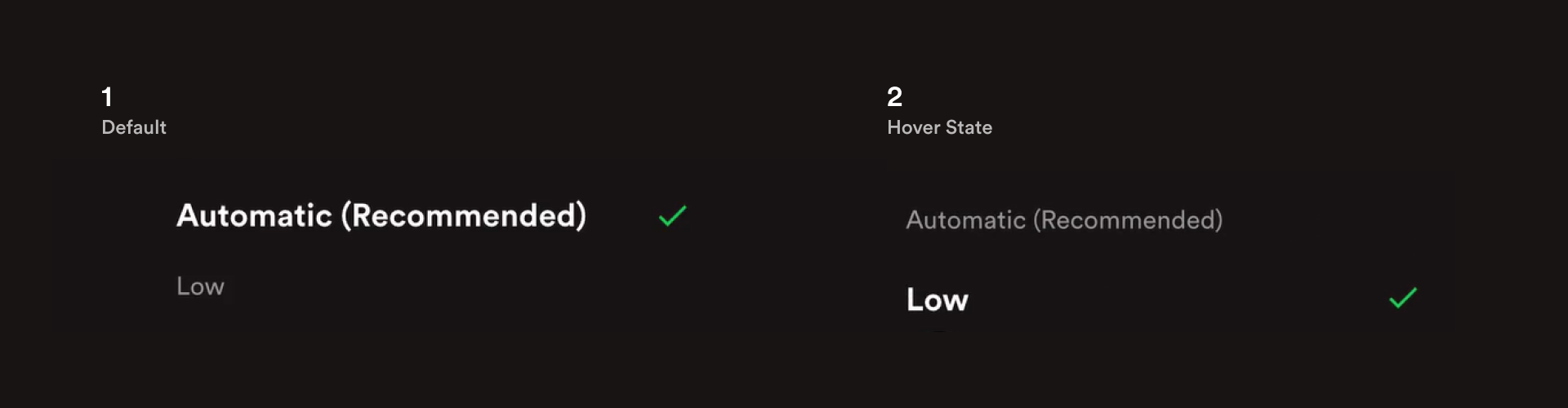
Old Multi-Toggle

New Multi-Toggle
To study switch interactions, I chose to recreate a multi-state selection menu that switches sound quality. My goal for this switch was to improve the hierarchy seen in the current system to make it more clear which item was selected. I did this by scaling up the selected element and adding weight to the font. When the user switches states, the font weight animates, and the arrow moves to the current item.
State Breakdown:
Project Reflection
This project provided me a great chance to really dive deep into small scale motion graphics, which is an area I had never had the chance to focus on before. Over the course of this micro-interactions project, it became more and more apparent how much these small moments of interaction can create cohesion for an overall product. Beyond that, it also urged me to think about how small animations can be indicative of certain actions in cases like the shuffle button, where there is a visual cue to represent something that's actually happening.