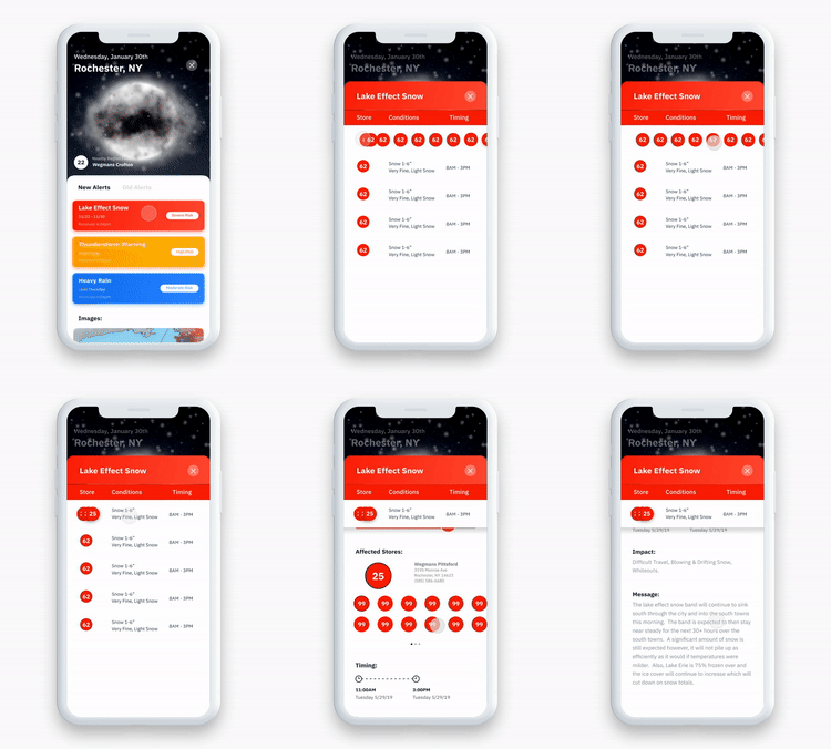
Wegmans Forecast is a mobile app designed to help the Wegmans Food Markets asset management team streamline weather alerts that affect the supply chain for their regional grocery stores.
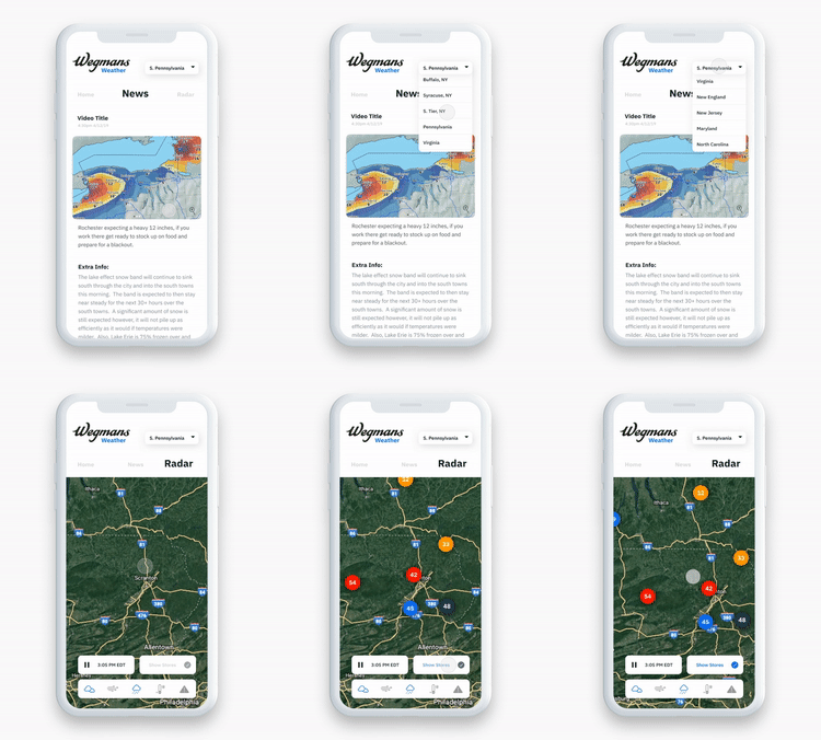
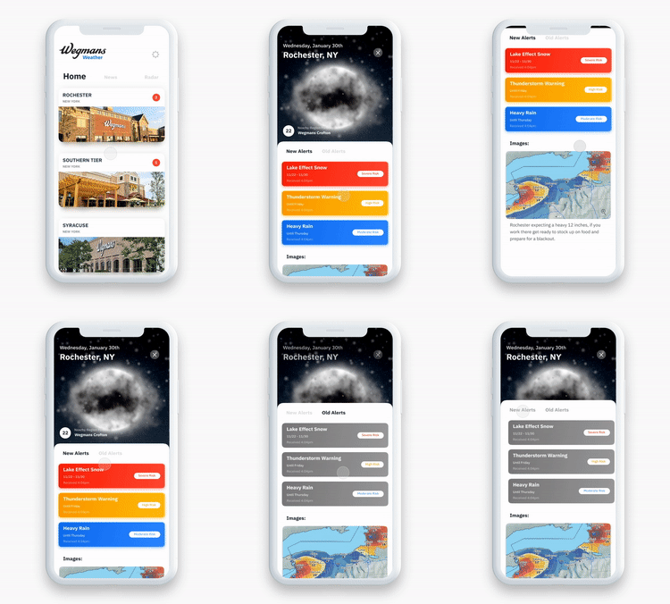
Background
This project was done over the course of 4 weeks in summer 2019 as the key focus of my internship working as a product designer for Wegmans’ asset protection team alongside one other design student.
Problem
The Wegmans asset protection team approached us to help come up with an idea for how to more efficiently communicate weather alerts.
Their previous method of communicating this - a generic spreadsheet of weather events, was often reaching the eyes it needed to far too late, if at all. Managers who did read the emails found them hard to interpret, especially since out of many weather events, only a couple might apply to the area they were responsible for.
We asked ourselves: how could we create a system that conveyed the right info in a timely manor, and helped managers reduce noise to only see what was relevant to them?
Key considerations
Time sensitivity - weather alerts need to be delivered in a timely manor, to a place where people would actually see them.
Noise/relevance ratio - it had to be easy to understand which part of the comms are relevant to me, as a recipient in charge of a specific region.
The Solution:
Process and branding:
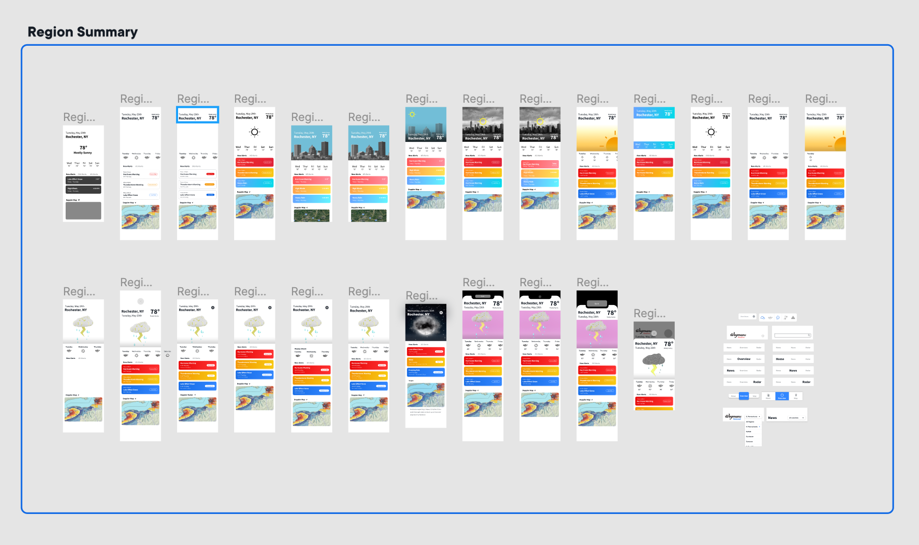
Region View - Iterations
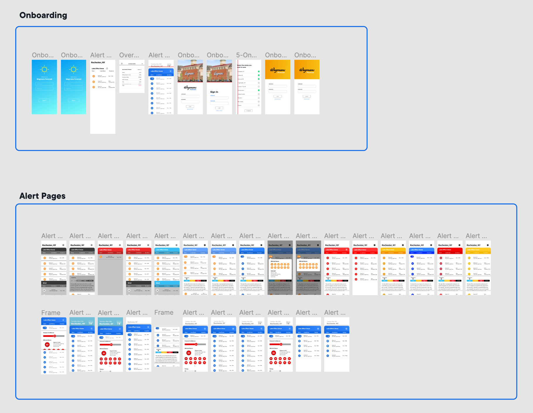
Event Card/Onboarding - Iterations
Takeaways
In terms of personal development, this project was an amazing opportunity to hone my craft in Figma and more advanced prototyping tools like Principle, learn from and collaborate with another designer who I became very close with, and have a chance to create product documentation for the very first time. All of those were incredible personal outcomes for this project, but the biggest (and hardest) lesson I had to learn was one in scope. Although we were upfront from the start about the resources needed to build an app with a content delivery network, at the end of the project, Wegmans ultimately decided not to move forward with development due to limited resources, and the live app never made it out. A valuable lesson in overdelivering an expensive solution to a problem that probably could have been solved with a lower fidelity experience.

